Good Afternoon Everybody,
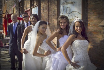
Our Master Class is off with a “bang”. We spent all day yesterday and a bit of the evening in some gorgeous locations with six great looking models (see below) getting some really beautiful photographs. We finally made it back to the classroom about 7:30 p.m. but in spite of the long day I believe everyone had a wonderful time putting some simple lighting and posing rules into action. All-in-all a great learning experience.
We covered a lot of “photographic territory” throughout yesterday’s shoot – from magnificent cathedrals to beautiful reception venues, to city parks, to the urban wilderness of downtown Cincinnati – and yes, the “natives” were restless yesterday but that’s another story.
Hey gang, as usual I’m running a little short of time this morning so let’s get right to today's post. Here we go…
Designing Your Wedding Image: Working To The Finished Result
I thought I’d approach today’s post a little different way. I thought I would walk you through HOW I design my final image walking you through what I’m seeing through the camera’s viewfinder, how I modify the composition to get closer to the final result I want to obtain, and the final adjustments I make to the image to realize that final result.
Hit the “Read More…” link below for the rest of the story.
The image I chose for today’s discussion comes from yesterday’s shoot and walks you through my creative process even as I struggled with a few lighting and composition issues – let me show you.
Take a look at this first image. My first thought was to have the bride framed up by the wall you see in the background. The problem was the fact that I had two people within view in the reception area at the bottom of the image. In this case, I decided to not ask them to move and planned to rework the composition.
Image 1.
Now take a look at Image 2. Here I decided to crop a bit more of the folks below out but I still couldn’t get rid of the gentleman in the bottom left of the image. I did think I could remove him easily in Photoshop so I took the image anyway. I like how the railing leads right to the bride, but I’m not thrilled with all the steps on the right side of the image. Still, I think the image looks pretty good.
Image 2.
Now let’s look at the third image. This time I repositioned the bride more in the center of the stairway. I decided that I liked this framing the best so far. All the lines visually lead directly to the bride and also framed her nicely. I’m still dealing with my folks in the background but I felt a little judicious cropping would solve my problem.
Image 3.
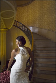
In the last image this is the photograph I was going for. I brought image 3 into Lightroom and cropped it closer. I still had the gentleman in the shot, but with judicious use of the Spot Removal tool and the Sharpness brush I was able to “disguise” his presence. I then use the Lens Correction feature to remove the convergence of the lines caused by my wide angle lens.
I love the finished result and I never once had to make the trip to Photoshop. Sure, I could still work on the bright areas you see near the top of the steps, but heck, it was 11 p.m. last night and I had an early wake up call for class this morning. I’ll plan to finish it up over the weekend ;~)
I hope you enjoyed my little walk the thought process I go through to capture the final image for presentation. I think this one came out well and I think a client seeing this image would love it – I’ll have to ask my bride later today what she thinks ;~)
_________________________________________________________
Hey gang, that’s it for me today. My Master Class beckons. I’ll plan to see everyone tomorrow for another Business Day Thursday – a few more images from our class this week.
Have a good one, and I’ll see you them, -David


Thanks for that, I always love walkthroughs that include the problem solving side and not just the final image and settings used. You're an inspiration, and a good teacher.
ReplyDeleteThis was a good walk through. I find that I get to much in a hurry and just need to slow down. Great image and post.
ReplyDeletelove the pics we did at the cincin club! you're amazing David! Gene D
ReplyDelete