Good Morning Everybody,
OK, I’m coming out of the closet today. I know it’s shocking news, but it’s true. Are you ready, I’m a Gleek. That’s right, I’m a really big gleek – a big fan of the hit TV show Glee, that is ;~)
Come the end of the day, LaDawn and I are your fairly boring couple who sits around watching Law and Order, CSI, or House enjoying a glass or wonderful wine or an adult beverage. I don’t even remember how we stumbled across our first episode of Glee, but I have to tell you – it was a defining moment in our TV viewing habits.
 Netflix just picked up the show too and you know what that meant – we could now get caught up on all the past episodes! We have been happily watching about three episodes an evening these last few weeks and finished the 21st episode last evening. The ensemble acting, the sometimes outrageous plots, the cast of characters (Come on – deep down – wouldn’t you really love playing Sue Sylvester’s part just one time?) - I just giggle my way through each episode. Oh, BTW, the singing is fantastic too.
What does this have to do with anything photographic? Absolutely nothing, but I just couldn’t go along living, blogging, existing till I came clean with our DPT readers. There, it’s out, I’m out, I’m or more accurately - we’re Gleeks, life can go on – I feel so relieved ;~)
Now on with today’s post.
The One That Got Away – It’s The Little Things That Count
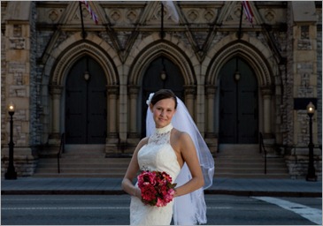
During my Master Class, one of the highlights of the week is the student image review we do on Wednesday and Thursday morning. Each class member selects their 5 favorite images, submits them anonymously, and LaDawn and I review them. The cool thing is that we record the entire image review and then give each class member a DVD of the entire review. Like I said, it’s a big hit at my class and a wonderful learning opportunity.
It’s become the basis for this series. With the class’s permission, I’ll select a few image these next few weeks and share with you the near misses and what could have enhanced these images even more. Lets take a look at this week’s image below.

First, what do I like about this image:
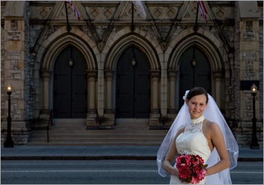
1. The lighting is perfect on the bride’s face. Just look at the beautiful loop lighting pattern on her face. The maker nailed it.
2. The balance of highlight to shadow is also nicely handled. The background is underexposed about a stop which makes our subject pop out of the scene.
3. I like, too, how the maker framed up the background, the front of a church in downtown Cincy – it’s perfectly centered. It makes a great background for this portrait of our bride.
4. The pose is easy, comfortable, and believable. Like I said, this image has a lot going for it.
So, you’re wondering why this image is a near miss – right? It comes down to a couple of little items. First – I would have liked a slightly better expression from the bride. Next I would have just slightly relaxed the the bouquet to a lower position on the bride’s left hip. These two critiques are very minor.
The major fault in my opinion is the position of the bride in the image. I mentioned above in #3 that the maker did a great job defining the background and then consciously framed it up for what looked to be a very symmetrical composition.
Now bring in the bride. The big question for me is why the bride wasn’t centered. The entire composition indicated at least to me, that the perfect position for the bride was “dead center” as we see in the next image – yes, I centered her up in Photoshop.
But do you see that moving the bride just a few inches to the right really makes the image come alive. As the viewer, my eye is lead right to the center of the image because of how the maker framed up the background.
Take a quick peek at the the setting without the bride – where does you eye go – right to that center door.
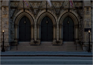
My quick rule of thumb is to place your subject where the eye is being directed, and in this case, that would be the center of the frame.
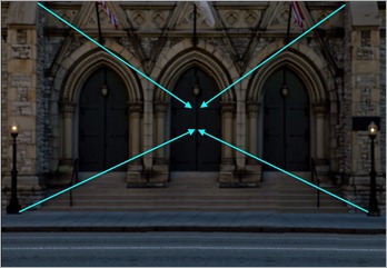
The original is still a nice photograph, but with the bride centered in the composition, it’s nearly a home run!
OK, now you’re thinking, “What’s Ziser mean – nearly a home run?” That’s right, nearly a home run. What would it take to make this image the rest of the way?
Glad you asked. It has to do with one more tiny little detail – the veil. Notice in the second photo above everything is pretty much symmetrically centered – the building, the bride, her arms and flowers. What’s missing – one final FIX of the veil. Let’s get it centered on the bride’s head. That should do it – all super simple, easy fixes that only would have taken a second or two to correct. Check out the final image below.
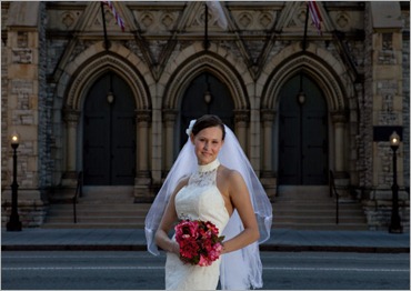
Now go take a peek at the first image one more time - what do you think? Like they say, sometimes it’s the little things that count ;~)
Update: The One That Got Away – It’s The Little Things That Count
A few of our DPT readers think the bride would look better in the bottom right hand corner at my “Nodal Point #4. See comments below. OK, let’s take a peek.
My thoughts with this subject placement – I think now the image becomes more an image of the church with the bride, who should be the primary compositional element, playing second fiddle. My eye still wants to go to that middle door as I showed in the 4th image above.
My vote still goes to image #5 above showing the bride centered in the composition. Simple, classic, no hesitation what you’re looking at – the bride. Now the background is playing second fiddle in the scene as it should.
_________________________________________________________
Hey gang, that’s it for me today. I’ve got a client coming by in about an hour to review images and make final album selections.
How about I see everyone tomorrow for another episode of Business Day Thursday.
Adios for now, David










 Picturecorrect.com
