Showing posts with label Color Management. Show all posts

Friday, December 16, 2011

Friday Wrap Up; The Costco Adventure Continues; & Creative Color Test Prints

Good Morning Everybody,

Today is our last day in this very beautiful part of the world, albeit a bit chilly today.  We head back to home sweet home tomorrow about mid-morning arriving after a short layover in Dallas, finally to touch down at the Greater Cincinnati Northern KY airport about 6:00 p.m. tomorrow evening.

Death masksIt's been a great trip – we’ve enjoyed the colors, sounds, tastes, unusual customs (like the Day of The Dead), blue skies, ocean breezes, and fabulous sunrises and sunsets, shared with great friends.  But it will still be nice to get back home and prepare for the holidays - my favorite time of the year. Hope you're looking forward to it too ;~)

Costco Update: The Printing Adventures Continue

OK gang, here is the latest from our Costco photo adventures.  Sarah and I finessed the portraits we captured last Saturday and had them looking great - now could we get Costco to do the same?

Then it hit me, I had the solution.  Costco needed to see exactly what we wanted but I had no test print available to show them. I opted for the second best thing. I loaded the test print and several of our portraits onto the iPad.  They looked WONDERFUL!  Now I had exactly what I needed to show the Costco photo department - a target print and a sampling of the portraits.  Off to Costco we headed.

Once we arrived we were lucky to connect with Rafael, one of the nicest guys in Mexico and luckily he spoke pretty good English too.  That’s Kent and I with the iPad and the old prints from the other day.

DAZ and Kent

We showed him the prints from our previous visit then pulled up the same images on the iPad along with the test print.  He saw what were talking about immediately.

I asked him to run our 8x10 test target without corrections to see what we would get.  Ten minutes later we hit the jackpot - the test print looked perfect!  I turned the rest of the images over to Rafael - 15 8x10's; 12 5x7's; and 105 4x6's.  As the prints were coming off the Noritsu printer, Rafael placed them on the counter for our approval - they all looked great!

About 20 minutes later we had the completed order in hand and were headed to the check-out. 224 pesos later, or about $17 US, we were on our way. OK, I bet you're really curious about what we paid for the images, right? Prepare to be amazed!
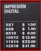
Costco pricesI've shown the cost conversion below:

  • 8x10's - $9.00 MX or $ .67 US
  • 5x7's -   $1.50 MX or $ .11 US
  • 4x6's -   $ .90  MX or $ .07 US

I know, I didn't believe it either - pretty darn inexpensive and still printed on Fuji's Crystal Archive paper - I don't know how they do it.

FramesToday we'll spend a little time getting all the 8x10's and 5x7's framed and deliver the entire "order" to the families in time for the holidays.

DAZNOTE: Getting the test prints on the iPad worked like a charm. You don't have test prints to carry around with you all the time, just upload them to your iPad ;~)

__________________________________________________________

Hey gang, that wraps up our Cabo adventures.  We're going to savor one more day in this wonderful land of paradise.  Hopefully LaDawn and I and all my pixels will make it back home safe and sound so I’ll see everyone again back in a slightly cooler Cincy bright and early Monday morning.  Have a great weekend and I'll see you then!

Adios, David

Tuesday, August 03, 2010

Technique Tuesday: Go Away Green! Shooting Mixed Lighting With Florescent Light? Get The Color Perfect In Lightroom 3

Good Morning Everybody,

Flower Dance Ahhhh…, another beautiful day in paradise around here, my program for Friday Photo School is about ready to go, and the whole world is coming up roses or tulips.  There, that should put everybody in a good mood where ever you are ;~)

That said, let’s get right to today’s Technique Tuesday.  Here we go…

Go Away Green! Shooting Mixed Lighting With Florescent Light? Get The Color Perfect In Lightroom 3

Do you ever have trouble getting those ugly greens out of the background and skin tones when shooting in mixed lighting conditions that include florescent fixtures? It really can be challenging now and then. This past weekend while working on a job in Lightroom 3, I was constantly challenged with that exact situation. After trying a few ideas I hadn't tried before and then, Bingo!, I had found a terrific solution to the problem.

Here is the deal. florescent green is not really green, it's closer to yellow, at least to Lightroom. In the past, I would just hit the color channels and desaturate the yellow channel. As long as there were no other predominate yellows in the scene, it worked pretty well.

Over the weekend, facing the same challenge, but this time with that nasty florescent greenish color in the shadow areas of the skin tones, the yellow "desaturate" option just wasn't working as well as I wanted. About half way through the job I looked at those color sliders again and decided to use the hue sliders instead. To make a long story short, watch the lesson below to see how easily I made my problem go away for good and give me great skin tones to boot - very cool.

_________________________________________________________

That's it for today's Technique Tuesday gang. I've got to get back to my real job so have a great day  and I'll see you tomorrow for a very provocative post – “Lightroom Production In "Slow-mo Mode".

See ya' then, David

Friday, October 02, 2009

Friday: Quick Hit Convention Picks

Good Morning Everybody,

I’m making this a quick post today – lots going on and too little time – here we go..

I just wrapped my 8:15 a.m. program, “Lightroom For Wedding Photographers”.  We had a decent crowd for that early morning wake up call and the program went well, that was until, I saw Adobe Lightroom Guru, Julieanne Kost in the back of the room.  She is like the best Lightroom guru in the world – and she was in the audience.

Nervous My knees went wobbly, my palms started to sweat, the mouse was jittering all over the keyboard – I was a mess.  OK, not really, but what an honor it was for her to sit in on my program.  BTW, you can catch some of the best Lightroom tutorials in the world over at Adobe TV right here.  Julieanne’s presentation and content is always top notch.  Go check it out – always good stuff.

Tech Expo Happenings

B&H is hosting their first ever Tech Expo theater this year.  I had the honor of presenting yesterday to a pretty darn full house. Thanks to all that attended.  You know even the Tech Expo is a great source of solid info for all that attend Photoshop World.  Julieanne Kost was presenting right next to me yesterday in the Adobe Theater.  The famous and always energetic Joe McNally was doing light demos in the Bogen booth. And that was just the tip of the iceberg – just ton's of good information, not to mention vendors, everywhere on the Tech Expo floor.

Metal Murals – A Cool Way To Show Off Your Images

Metal Mural We first ran into Metal Mural [link] a few years ago at the PPA Convention  in Tampa.  They offer one of the most unusual and equally impressive products for image display that I have ever seen.  Here is the link to their gallery page right here.

The print to metal and the finished product is striking.  I was talking with Pola who was giving us a tour of what they offer.  Turns out I just uploaded one of my images to Metal Mural and it will  be on display at my Digital WakwUp Call tour in Newark, NJ in about a week an a half. I can’t wait to see it.

A New Way To Balance Your Color

I ran into the good folks at Athentech Imaging yesterday. I first ran into them about 2 1/2 years ago at a WPPI convention.  They were showing the BETA of the Perfectly Clear technology which they were promoting as the best, fastest and easiest way to great color. 

Perfectly Clear I hadn’t seen then since, but yesterday there they were.  I said HI to Brad the owner and he brought me up to date with what they have been up to.  They are just days away from releasing their Photoshop plug-in and he promised to send me a copy.  I’ll keep you posted.

I’ll tell you, what ever technology they are using behind the secret door looks pretty cool.  You can find out more of what they are up to over at their web site right here.http://www.digitalwakeupcall.com/

What A Really Cool Web Site That’s Easy To Design Yourself?

I ran into my buddy and great photographer, David Jay late afternoon at the show.  His company, ShowIt Sites [link]is showing their second generation flash web sites. I’ve been following David as he has been developing this very innovative new way to web site design. I know I’m sketchy on this right now, but I’ll know more next week.  I’ll share more info then.

LaDawn’s HELP WANTED AD!

Help Wanted Hey gang -- LaDawn wanted me to put out the call for a volunteers who want to help for the next leg of the Digital WakeUp Call tour.  Starting October 5 she needs help in Boston 10/5, Hartford 10/6, NY-LaGuardia 10/7, and NY-Manhattan 10/8. Please email LaDawn at ladawn@ziser.com for additional times and information.

Hey gang, I’ve got to get back to the show.  I’m scheduled for a booth demo at Westcott at 1:00 p.m. and I want to take in some more of the show. Everybody have a great weekend and we’ll see you in Boston back on the Digital WakeUp Call tour trail on Monday.  -David

Wednesday, April 16, 2008

So What's The Best Color To Use Here?

Ever have trouble working out color schemes for your web site, design pieces, or maybe even your living room decorating project? Check out this nifty little site right here. It's called ColorSchemer and with a click of a mouse, it will show you all the related colors to work with the main color of your choice - kind of a cool little color resource. Here is the link to their blog.

Tuesday, March 25, 2008

This Is How It's Supposed To Look In Lightroom

OK, you gave it your best shot, you followed all the rules, you used all the best plug-ins out there, you referenced every book out there on color correction and your image still doesn't look right. It's just not how you remember it. It's just TOO neutral - so what do you do?

Boy, I just witnessed this first hand recently when we were recruiting and eventually hired a new digital tech in my studio. We interviewed 4 candidates, and then selected three for our "digital try-outs." Jen, my studio manager, selected about 20 images with colors all over the place - some in tungsten lighting, mixed lighting, daylight - a real challenge for our candidates.

We reviewed the images and what was apparent to me was the fact that most of the candidates were going for that perfectly neutral color without regard to the setting and feel of the image. I like my ceremony images to be slightly warm to reflect the surrounds of the church, for instance. The same is true if I drag the shutter in a church or a nice hotel where I pick up the ambient light too. The warm ambient needs to be reflected in the final image. That is to say - I don't want my result to be a perfectly neutral in color density images lacking the ambiance of the scene.

What I'm trying to say.... is that the final result is a subjective conclusion from the person doing the color correction. And that subjective solution must be based on the setting, the scene, and the subject matter. That all being said, check out the tutorial from George Jardine entitled, "Lightroom - Subjective Color Correction" - links below.

In this tutorial he outlines the basics of color correction, in a situation where the color and density of the photograph are wide open to interpretation.
This tutorial can be downloaded from George's iDisk right here. This podcast is labeled “20080224 Tutorial Podcast - Subjective Color Correction” in the Public directory. Or, you can find it on iTunes by searching under Podcasts for “Lightroom”. The RSS feed is right here.

Monday, March 24, 2008

Who’s Got My Monkey – I Mean Munki

I almost forgot to mention this last week, but it was one of the hot topics at the show. Several of the presenters mentioned it from stage and it had good buzz in the trade show. Here is their quick blurb about the ColorMunki product -

The ColorMunki was designed for the digital work flow of social, wedding and portrait photographers -- or anyone passionate about photography -- ColorMunki Photo delivers an easy, quick and affordable solution for matching colors from display-to-print. It was developed with professional photographers input, ColorMunki Photo is a completely integrated, versatile solution that calibrates displays, projectors and printers, measures ambient light and captures spot colors. ColorMunki Photo gives photographers ultimate color control for their images.

You can read the complete press release over at ImagingInsider right here. Also, check out ColorMunki.com right here for all their info. The word around the show was “Amazing.” Check it out.

Monday, March 17, 2008

NIK-Viveza Is Magical

One of the first booth locations I want to visit today is the NIK software booth. They just recently announced their new Viveza software. Master Color and Light, Effortlessly - that's their claim. I took a peek at their demo online and was "blown away". I think NIK's new software could be workflow "rocket fuel". Check out the demo here - see what you think - I'm heading over to see it up close and personal. I'll give you the low down this week.